


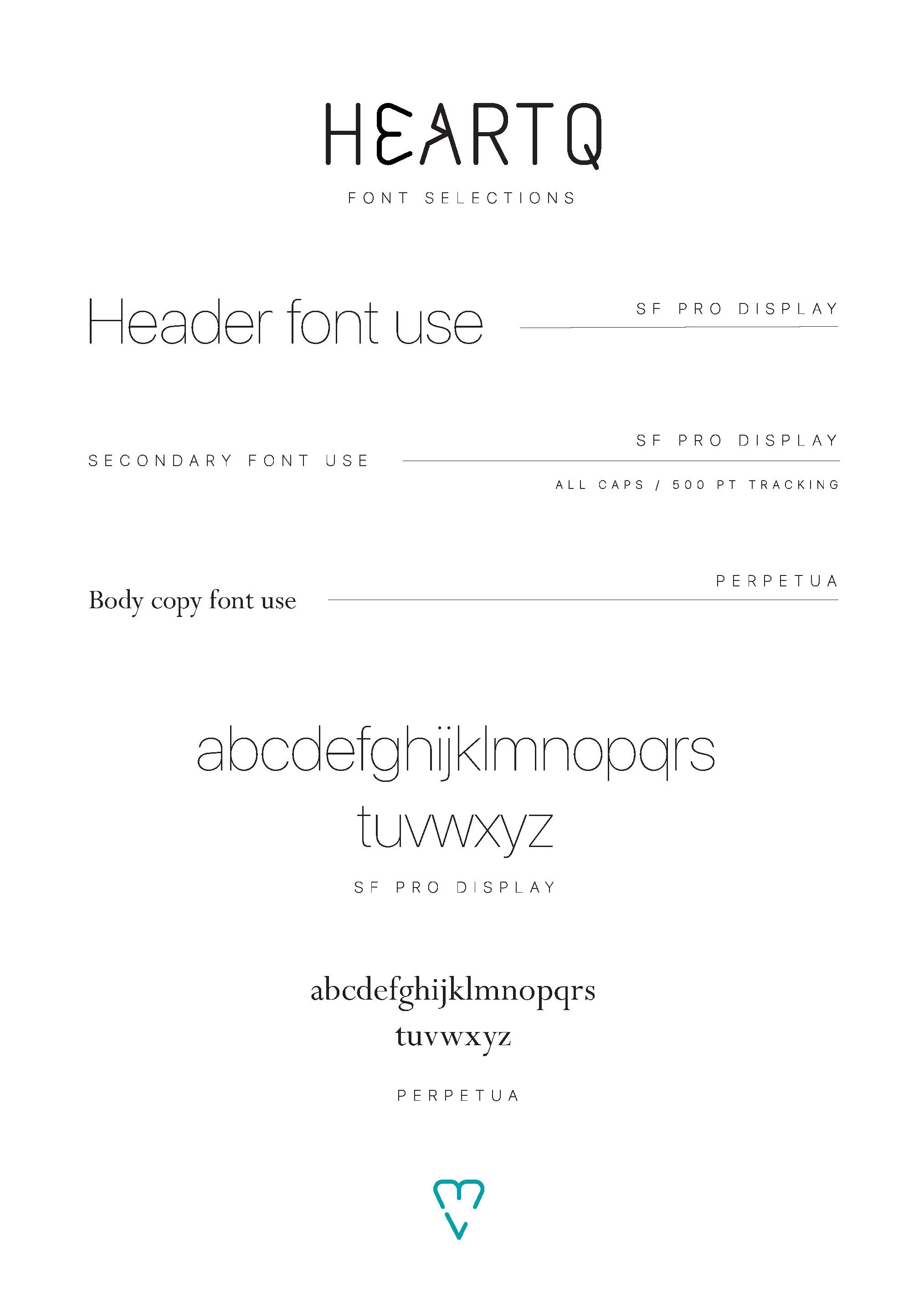
This brand was built for two cardiologists starting a company that educated fellow doctors on the brain-heart connection and how it impacts health. He wanted it to feel more science-based, and she wanted it to have a more friendly feel, so I married the two.
I made sure to include both warm, friendly colors as well as colors that lean more toward cold, science-based palettes. You’ll notice the heart is featured in the primary logotype but on its side. The second logotype, it’s counterpart emblem, is the heart featured in a circular bounding box.
The goal of the brand’s experience would include masterminds, merchandise, webinars, and various curriculum for the leading doctors in the country.